
Creating an Effective Presentation: Integrating Excel Data Into PowerPoint for Organizational Charts

Creating an Effective Presentation: Integrating Excel Data Into PowerPoint for Organizational Charts
Quick Links
Building an organizational chart in Excel makes sense because it’s easy to pull data from sources like other Excel documents or Outlook. When it comes time to show off that chart, you’ll probably want to use PowerPoint, though. Fortunately, bringing the Excel chart over to PowerPoint is fairly simple.
Creating the Organizational Chart in Excel
First, open a new Excel sheet. Head over to the “Insert” tab and select the “SmartArt” option.

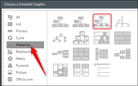
The “Choose a SmartArt Graphic” window will appear. In the pane on the left-hand side, select “Hierarchy.” You’ll see several different chart styles appear on the right. Choose the one that suits your needs best. In this example, we’ll choose the “Name and Title Organizational Chart” option.
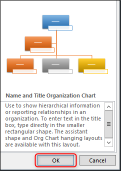
After you select your chart style, a preview of the chart and the chart’s description will appear on the right-hand side of the window. Select “OK” when you’re ready.
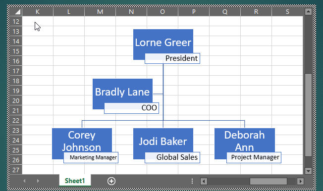
Your chart will now appear in the Excel sheet. Fill out the relevant information for your team members in the chart (or pull the data from other sources). Once you’re finished, you should have something that looks like this.
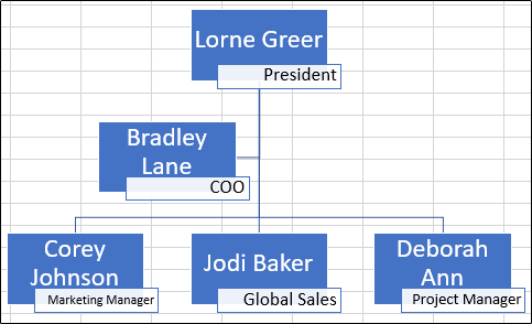
Our chart includes team members and their respective positions. Double-check to make sure the information is correct, save the Excel file, then exit out.
Inserting Your Organizational Chart in PowerPoint
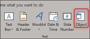
Now it’s time to work in PowerPoint. Open up your presentation and move to the slide where you want the organizational chart. Go to the “Insert” tab and select “Object.”
The “Insert Object” window will appear. Here, choose the “Create from file” option and select “Browse.”
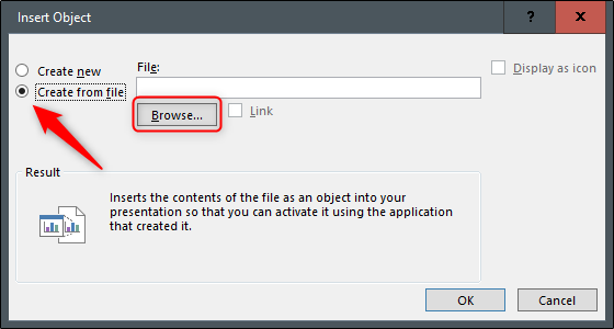
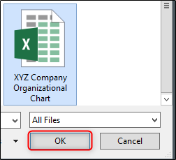
Go to the location of the Excel file containing the organizational chart, select it, and then click “OK.”
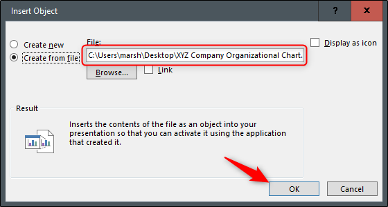
Make sure the file path is correct and then click “OK.”
Your organizational chart from Excel now appears in your PowerPoint presentation! If you need to edit any of the content inside the chart, it’s as simple as double-clicking the chart and editing the content. You’ll have full access to Excel tools when you do.
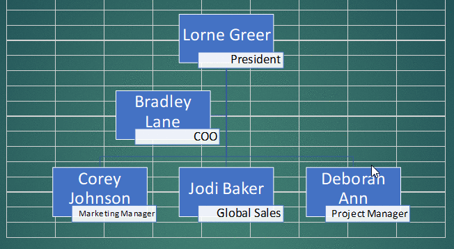
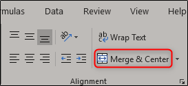
Merging the cells in the background may also be a good idea, as they can be quite distracting. To do so, double click the chart and then select all of the cells that appear.
O the “Home” tab, select “Merge & Center.”
Now you’ll have a nice, clean organizational chart in your PowerPoint presentation. Good luck!
Also read:
- [FINALIZED] Say Goodbye to Call of Duty: Black Ops Cold War PC Issues! Master These Fixes for Seamless Gaming in 202지
- [New] Crafting Shareable Instagram Stories That Spread Like Wildfire for 2024
- [New] In 2024, From Canvas to Cryptos Select 7 NFT-Creating Powerhouses
- [New] Prime Choices for Valheim's Agricultural Success
- [Updated] Comprehensive Walkthrough for Bulk TikTok Download
- [Updated] The Role of Crossfade in Modern Music Mixing
- Guide to Resolving Palworld Session Search Problems – A Step-by-Step Approach
- In 2024, Apple ID Unlock On iPhone 7? How to Fix it?
- Mastering Fixes for Launching Overwatch 2 as of 2024: A Step-by-Step Guide
- Navigating the Complexities of Crypto Regulations: Insights From YL Software Experts
- PC Gaming: Unraveling the Mystery Behind the Double Drop in FPS
- Recovering Deleted Execution Records on Windows
- Solving Freezing Issues in Call of Duty: Black Ops Cold War - A Step-by-Step Guide
- Top 5 Simple Strategies for Repairing WINWORD.EXE Hiccups
- Ultimate Solution: Resolving Your Football Manager 202N1 Issues on Windows Computers
- Updated In 2024, The Ultimate List of Photo and Video Montage Makers
- Title: Creating an Effective Presentation: Integrating Excel Data Into PowerPoint for Organizational Charts
- Author: Christopher
- Created at : 2024-12-10 19:42:01
- Updated at : 2024-12-12 17:09:27
- Link: https://win-blog.techidaily.com/creating-an-effective-presentation-integrating-excel-data-into-powerpoint-for-organizational-charts/
- License: This work is licensed under CC BY-NC-SA 4.0.