Expert Tips on Building & Personalizing Funnel Charts with Microsoft Excel Tools
Expert Tips on Building & Personalizing Funnel Charts with Microsoft Excel Tools
Quick Links
A funnel chart is great for illustrating the gradual decrease of data that moves from one stage to another. With your data in hand, we’ll show you how to easily insert and customize a funnel chart in Microsoft Excel.
As the name implies, a funnel chart has its largest section at the top. Each subsequent section is smaller than its predecessor. Seeing the largest gaps allows you to quickly identify stages in a process that can improve.
When to Use a Funnel Chart
Most commonly used to show phases in a sales process, you can use a funnel chart for other types of data as well. As examples, you may use one to display a flow of information, an order fulfillment procedure, or a business process flow.
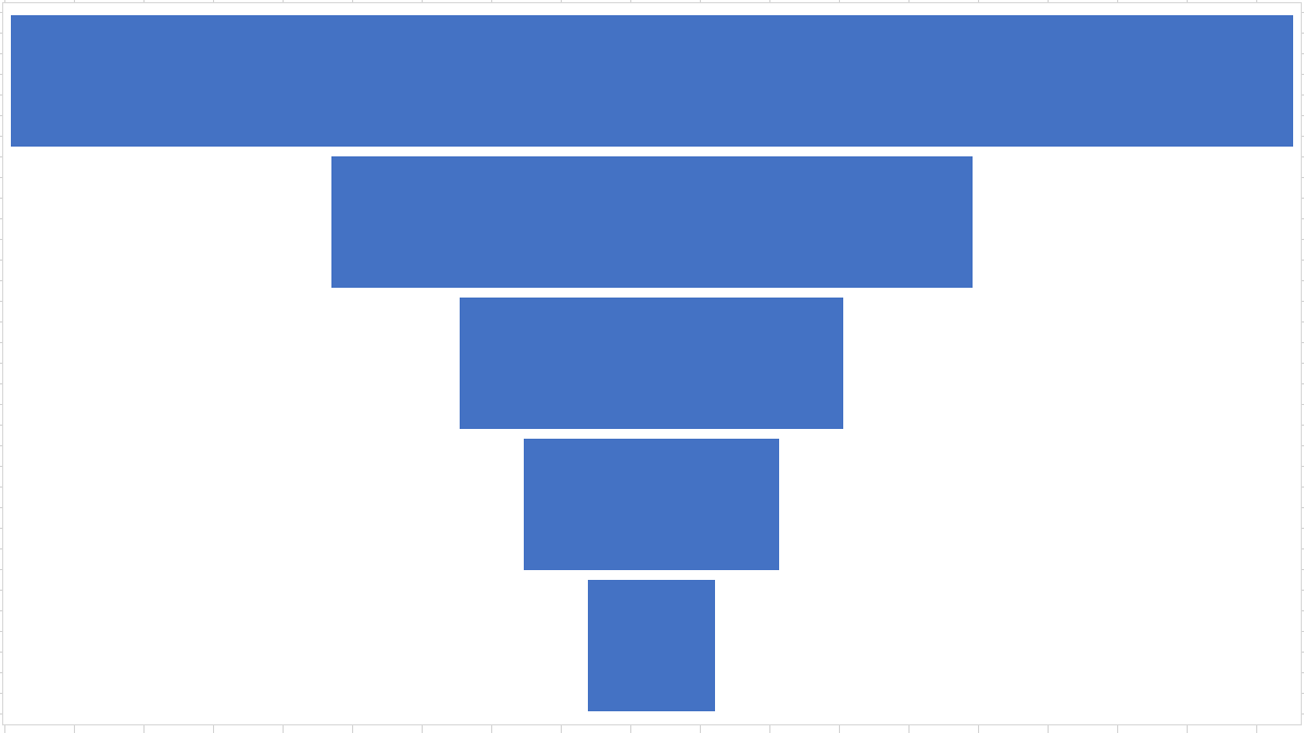
For this how-to, we’ll stick with sales data. We have an email campaign for our new membership program. We’ll use a funnel chart to show the process from the email blast to prospective members to those from that pool who subscribed.
We’ll show numbers for each category, or stage, in the process for our funnel chart:
- Emails sent
- Emails opened
- Link visited
- Signed up for trial
- Subscribed
Create a Funnel Chart in Excel
Open your spreadsheet in Excel and select the block of cells containing the data for the chart.
Head to the Insert tab and Charts section of the ribbon. Click the arrow next to the button labeled Insert Waterfall, Funnel, Stock, Surface, or Radar Chart and choose “Funnel.”
The funnel chart pops right into your spreadsheet. From it, you can review the data and as mentioned, see the largest gaps in your process.
For example, we see here the huge reduction from the number of emails sent to the number opened. So we know that we need to better entice potential members to actually open that email.
We can also see the small gap between those who signed up for the trial and then subscribed. This shows us that this particular stage in the process works pretty well.
Customize Your Funnel Chart
As with the other types of charts in Excel such as a waterfall or treemap , you can customize the funnel chart. This not only helps you include the most important elements in your chart but also gives its appearance a bit of a boost.
The best place to start when editing your chart is with its title. Click the default Chart Title text box to add a title of your own.
Next, you can add or remove chart elements, choose a different layout, pick a color scheme or style, and adjust your data selection. Select the chart and click the Chart Design tab that displays. You’ll see these options in the ribbon.
If you’d like to customize the line styles and colors, add a shadow or 3-D effect, or size the chart to exact measurements, double-click the chart. This opens the Format Chart Area sidebar where you can use the three tabs at the top to adjust these chart items.
With Excel on Windows, you have a couple of additional ways to edit your chart. Select the chart and you’ll see two buttons appear on the right. On top is Chart Elements and below is Chart Styles.
- Chart Elements: Add, remove, or reposition elements on the chart like data labels and a legend.
- Chart Styles: Use the Style and Color tabs to add some pizzazz to your chart’s appearance.
Once you finish customizing your chart, you can also move it or resize it to fit nicely on your spreadsheet. To move the chart, simply select and drag it to its new spot. To resize it, select it and drag inward or outward from an edge or corner.
If you have city, state, or other location data, take a look at how to create a geographical map chart in Excel .
Also read:
- [Updated] QuickNetflix Screenshots A Mac User's Guide
- 2024 Solutions for a Smooth Run of Cities: Skylines – Fixing Common Crashes and Bugs
- 6 Solutions to Fix Error 505 in Google Play Store on Tecno Spark 20C | Dr.fone
- Alleviate I/O Scheduling Conflict
- Complete Tutorial to Use VPNa to Fake GPS Location On Honor 70 Lite 5G | Dr.fone
- Dying Light Performance Issues Solved: Ending Those Annoying Lags
- Enhance Gameplay Fluidity: Effective Fixes for Dying Light's Graphics Glitches
- Expert Tips for Crafting Viral Video Content Using MassMail Tool – Boost Your Digital Presence Effortlessly
- Get Updated Windows 1N Support: RTX 2060 Super GPU Drivers Download
- How to Successfully Install Age of Empires IV: Overcoming MSTSC Hurdles
- In 2024, 5 Solutions For Huawei Nova Y91 Unlock Without Password
- Life Is Strange: True Colors Glitch Resolution
- Outriders Slow Performance Troubleshooting Guide
- Protecting Sensitive Information When Integrating ChatGPT Into Your Workflow
- The Division 2 Game Crash Fix - Fast, Simple Steps to Resolve
- The Legend of Zelda: Improve Graphics & Speed with Advanced Tweaks
- Top 4 Ways to Trace Motorola Moto G84 5G Location | Dr.fone
- Who Takes The Lead In Live-Action Footage, Hero 4 or X1000V?
- Winning Against Fortnite's Windows Display Problem: Solutions Unveiled
- Title: Expert Tips on Building & Personalizing Funnel Charts with Microsoft Excel Tools
- Author: Christopher
- Created at : 2024-12-11 16:55:55
- Updated at : 2024-12-12 16:44:54
- Link: https://win-blog.techidaily.com/expert-tips-on-building-and-personalizing-funnel-charts-with-microsoft-excel-tools/
- License: This work is licensed under CC BY-NC-SA 4.0.