
Step-by-Step Guide: Creating a Linear Calibration Curve Using Microsoft Excel

Step-by-Step Guide: Creating a Linear Calibration Curve Using Microsoft Excel
Quick Links
Excel has built-in features that you can use to display your calibration data and calculate a line-of-best-fit. This can be helpful when you are writing a chemistry lab report or programming a correction factor into a piece of equipment.
In this article, we’ll look at how to use Excel to create a chart, plot a linear calibration curve, display the calibration curve’s formula, and then set up simple formulas with the SLOPE and INTERCEPT functions to use the calibration equation in Excel.
What is a Calibration Curve and How is Excel Useful When Creating One?
To perform a calibration, you compare the readings of a device (like the temperature that a thermometer displays) to known values called standards (like the freezing and boiling points of water). This lets you create a series of data pairs that you’ll then use to develop a calibration curve.
A two-point calibration of a thermometer using the freezing and boiling points of water would have two data pairs: one from when the thermometer is placed in ice water (32°F or 0°C) and one in boiling water (212°F or 100°C). When you plot those two data pairs as points and draw a line between them (the calibration curve), then assuming the response of the thermometer is linear, you could pick any point on the line that corresponds to the value the thermometer displays, and you could find the corresponding “true” temperature.
So, the line is essentially filling in the information between the two known points for you so that you can be reasonably certain when estimating the actual temperature when the thermometer is reading 57.2 degrees, but when you have never measured a “standard” that corresponds to that reading.
Excel has features that allow you to plot the data pairs graphically in a chart, add a trendline (calibration curve), and display the calibration curve’s equation on the chart. This is useful for a visual display, but you can also calculate the formula of the line using Excel’s SLOPE and INTERCEPT functions. When you enter these values into simple formulas, you will be able to automatically calculate the “true” value based on any measurement.
Let’s Look at an Example
For this example, we will develop a calibration curve from a series of ten data pairs, each consisting of an X-value and a Y-value. The X-values will be our “standards,” and they could represent anything from the concentration of a chemical solution we are measuring using a scientific instrument to the input variable of a program that controls a marble launching machine.
The Y-values will be the “responses,” and they would represent the reading the instrument provided when measuring each chemical solution or the measured distance of how far away from the launcher the marble landed using each input value.
After we graphically depict the calibration curve, we will use the SLOPE and INTERCEPT functions to calculate the calibration line’s formula and determine the concentration of an “unknown” chemical solution based on the instrument’s reading or decide what input we should give the program so that the marble lands a certain distance away from the launcher.
Step One: Create Your Chart
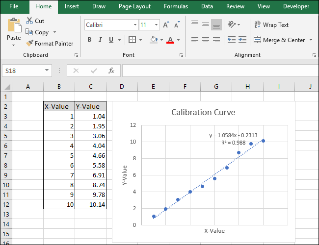
Our simple example spreadsheet consists of two columns: X-Value and Y-Value.
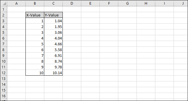
Let’s start by selecting the data to plot in the chart.
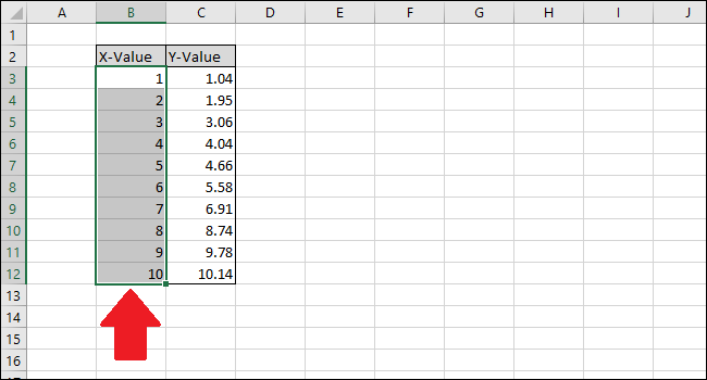
First, select the ‘X-Value’ column cells.
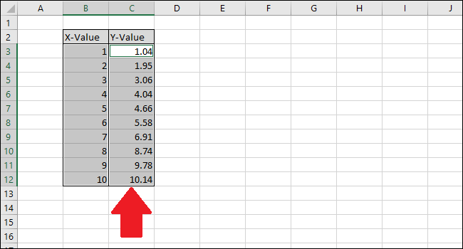
Now press the Ctrl key and then click the Y-Value column cells.
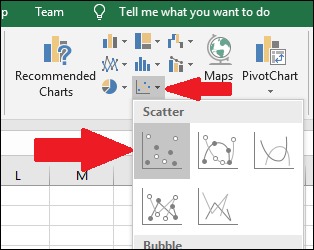
Go to the “Insert” tab.

Navigate to the “Charts” menu and select the first option in the “Scatter” drop-down.
A chart will appear containing the data points from the two columns.
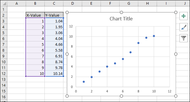
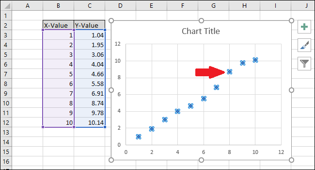
Select the series by clicking on one of the blue points. Once selected, Excel outlines the points will be outlined.
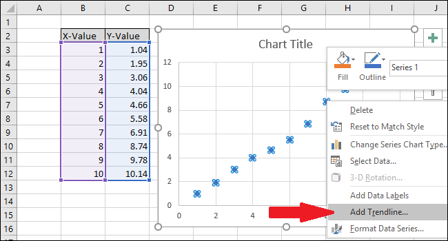
Right-click one of the points and then select the “Add Trendline” option.
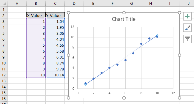
A straight line will appear on the chart.
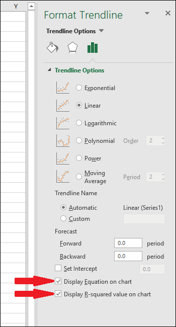
On the right side of the screen, the “Format Trendline” menu will appear. Check the boxes next to “Display Equation on chart” and “Display R-squared value on chart.” The R-squared value is a statistic that tells you how closely the line fits the data. The best R-squared value is 1.000, which means every data point touches the line. As the differences between the data points and the line grow, the r-squared value drops, with 0.000 being the lowest possible value.
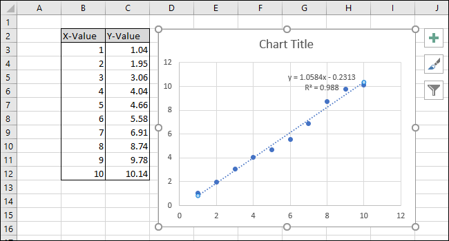
The equation and R-squared statistic of the trendline will appear on the chart. Note that the correlation of the data is very good in our example, with an R-squared value of 0.988.
The equation is in the form “Y = Mx + B,” where M is the slope and B is the y-axis intercept of the straight line.
Now that the calibration is complete, let’s work on customizing the chart by editing the title and adding axis titles.
To change the chart title, click on it to select the text.
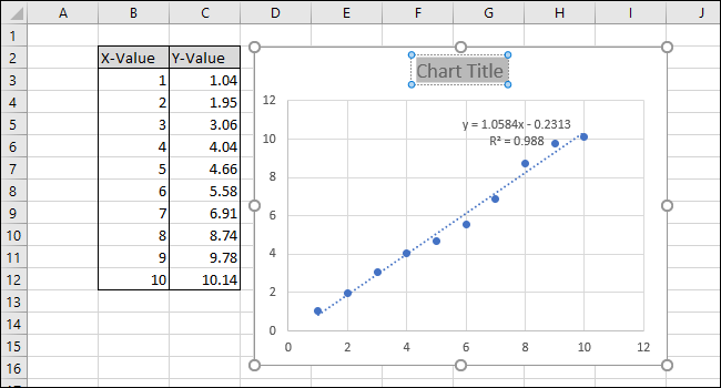
Now type in a new title that describes the chart.
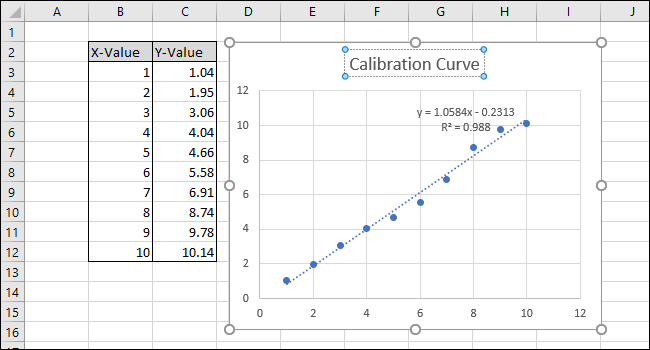
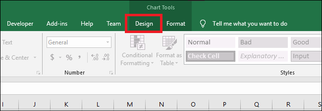
To add titles to the x-axis and y-axis, first, navigate to Chart Tools > Design.
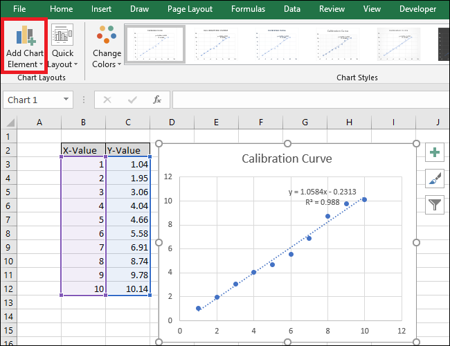
Click the “Add a Chart Element” drop-down.
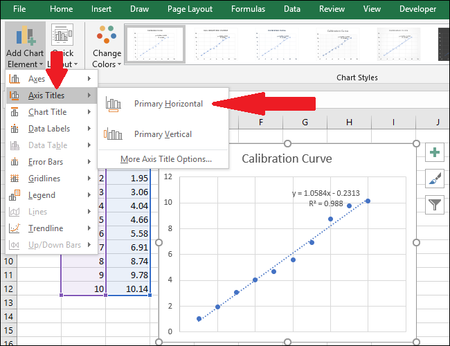
Now, navigate to Axis Titles > Primary Horizontal.
An axis title will appear.
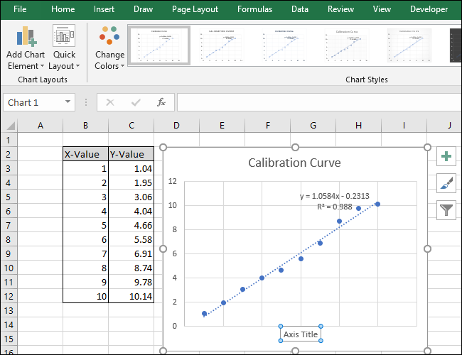
To rename the axis title, first, select the text, and then type in a new title.
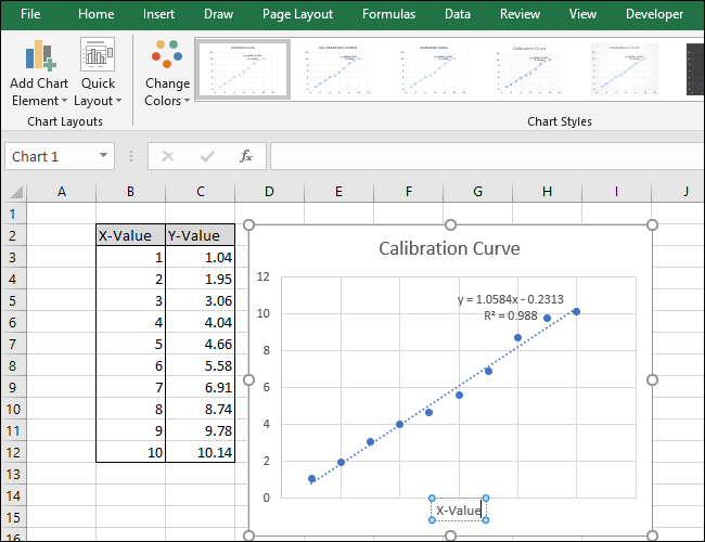
Now, head to Axis Titles > Primary Vertical.
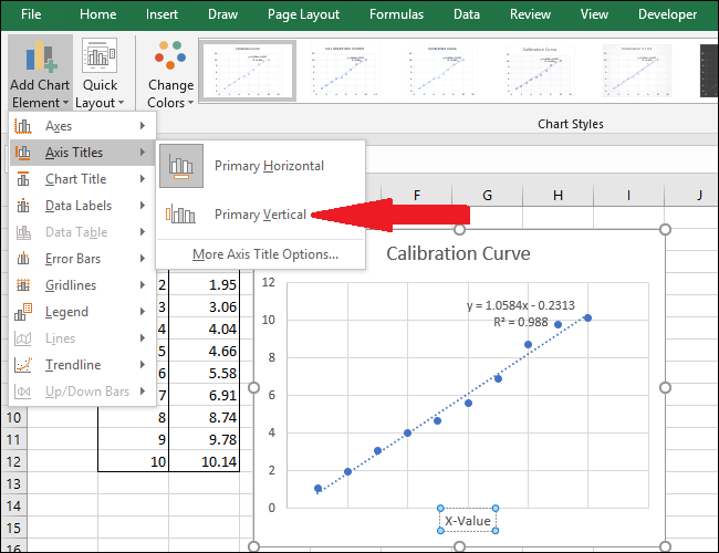
An axis title will appear.
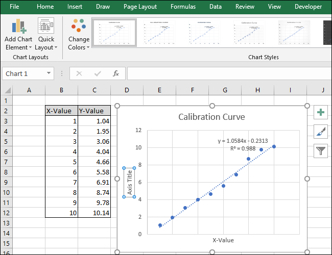
Rename this title by selecting the text and typing in a new title.
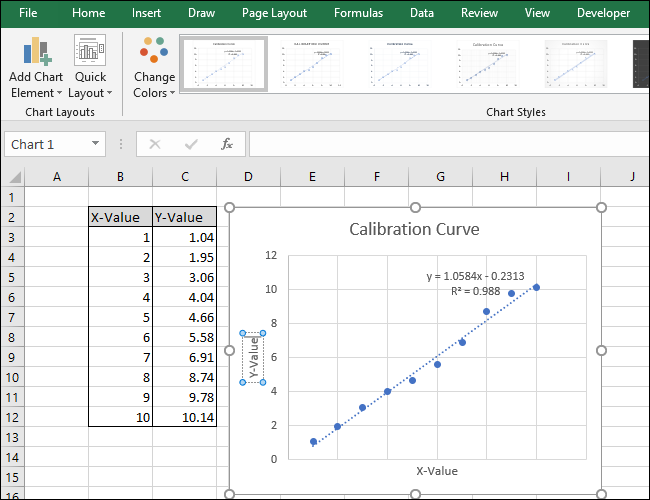
Your chart is now complete.
Step Two: Calculate the Line Equation and R-Squared Statistic
Now let’s calculate the line equation and R-squared statistic using Excel’s built-in SLOPE, INTERCEPT, and CORREL functions.
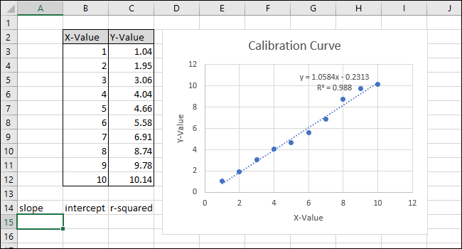
To our sheet (in row 14) we’ve added titles for those three functions. We’ll perform the actual calculations in the cells beneath those titles.
First, we will calculate the SLOPE. Select cell A15.
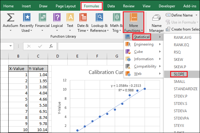
Navigate to Formulas > More Functions > Statistical > SLOPE.
The Function Arguments window pops up. In the “Known_ys” field, select or type in the Y-Value column cells.
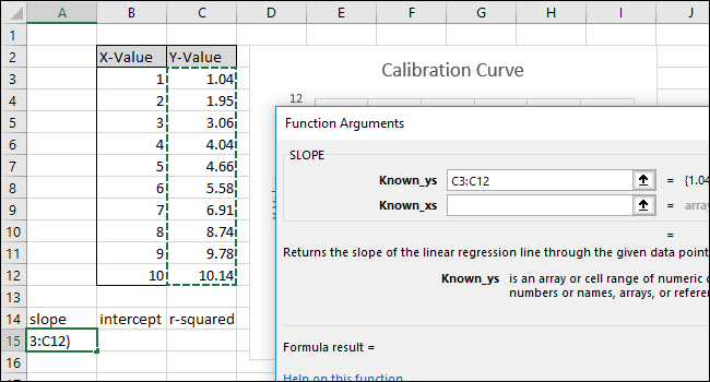
In the “Known_xs” field, select or type in the X-Value column cells. The order of the ‘Known_ys’ and ‘Known_xs’ fields matters in the SLOPE function.
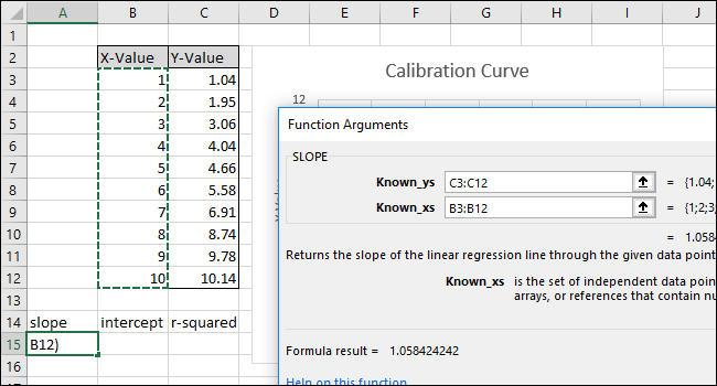
Click “OK.” The final formula in the formula bar should look like this:
`=SLOPE(C3:C12,B3:B12)`
Note that the value returned by the SLOPE function in cell A15 matches the value displayed on the chart.
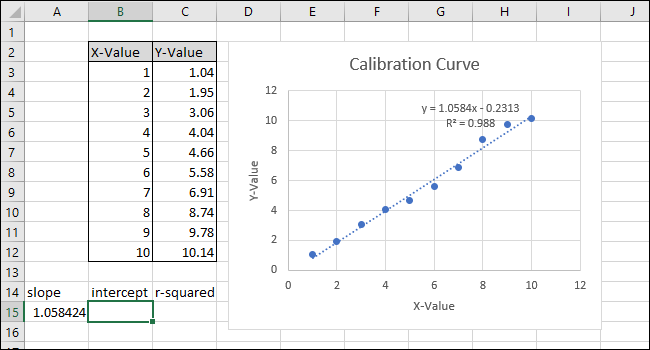
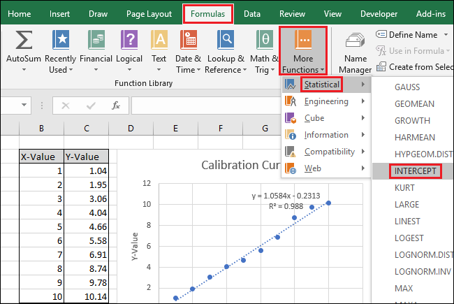
Next, select cell B15 and then navigate to Formulas > More Functions > Statistical > INTERCEPT.
The Function Arguments window pops up. Select or type in the Y-Value column cells for the “Known_ys” field.
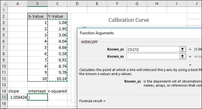
Select or type in the X-Value column cells for the “Known_xs” field. The order of the ‘Known_ys’ and ‘Known_xs’ fields also matters in the INTERCEPT function.
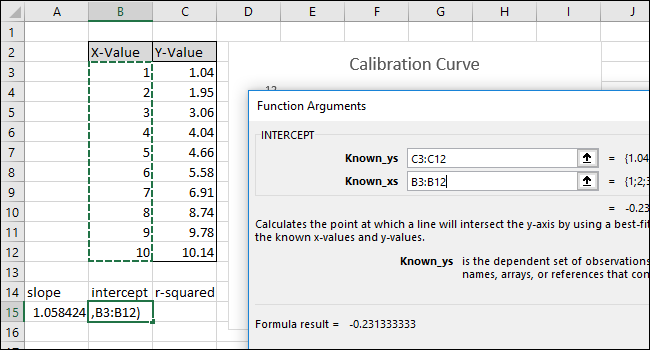
Click “OK.” The final formula in the formula bar should look like this:
`=INTERCEPT(C3:C12,B3:B12)`
Note that the value returned by the INTERCEPT function matches the y-intercept displayed in the chart.
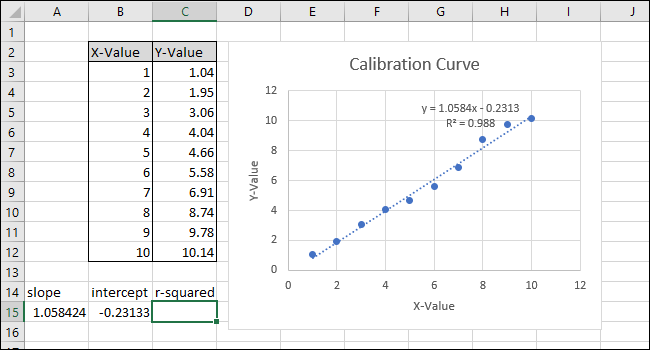
Next, select cell C15 and navigate to Formulas > More Functions > Statistical > CORREL.
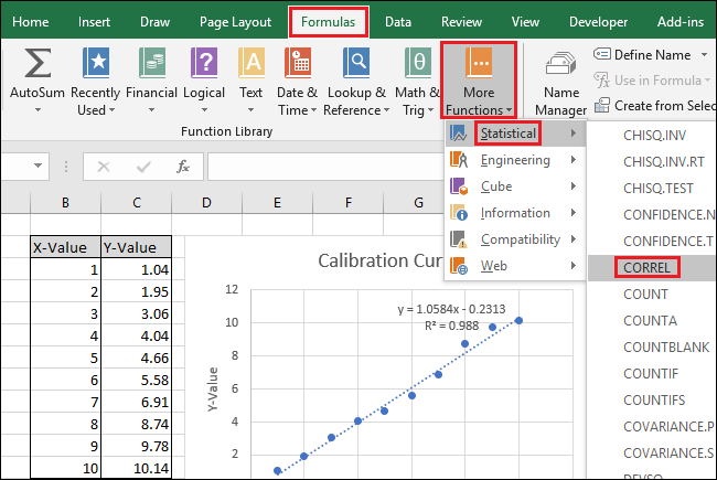
The Function Arguments window pops up. Select or type in either of the two cell ranges for the “Array1” field. Unlike SLOPE and INTERCEPT, the order does not affect the result of the CORREL function.
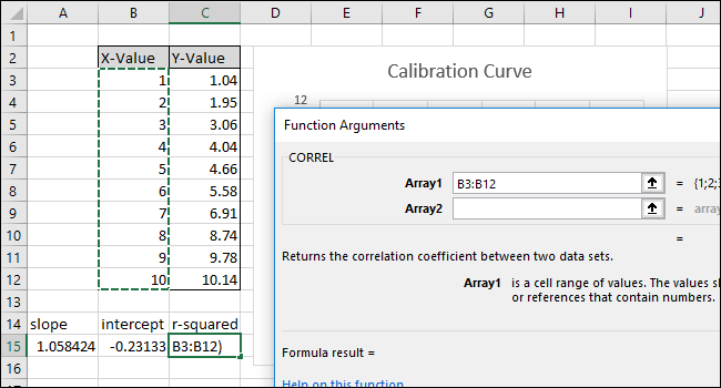
Select or type in the other of the two cell ranges for the “Array2” field.
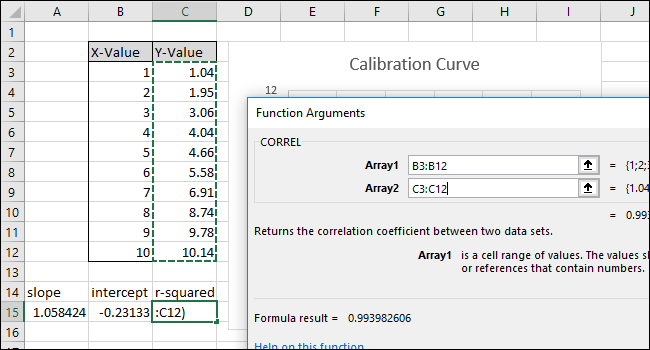
Click “OK.” The formula should look like this in the formula bar:
`=CORREL(B3:B12,C3:C12)`
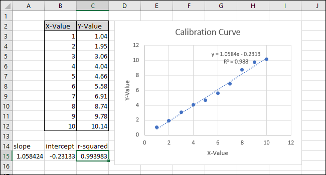
Note that the value returned by the CORREL function does not match the “r-squared” value on the chart. The CORREL function returns “R,” so we must square it to calculate “R-squared.”
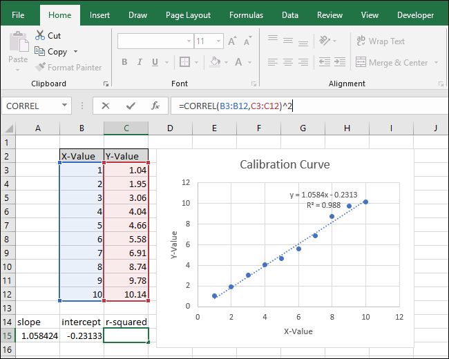
Click inside the Function Bar and add “^2” to the end of the formula to square the value returned by the CORREL function. The completed formula should now look like this:
`=CORREL(B3:B12,C3:C12)^2`
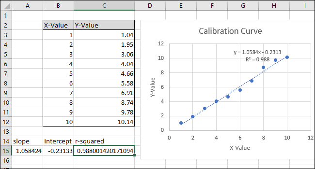
Press Enter.
After changing the formula, the “R-squared” value now matches the one displayed in the chart.
Step Three: Set Up Formulas For Quickly Calculating Values
Now we can use these values in simple formulas to determine the concentration of that “unknown” solution or what input we should enter into the code so that the marble flies a certain distance.
These steps will set up the formulas required for you to be able to enter an X-value or a Y-value and get the corresponding value based on the calibration curve.
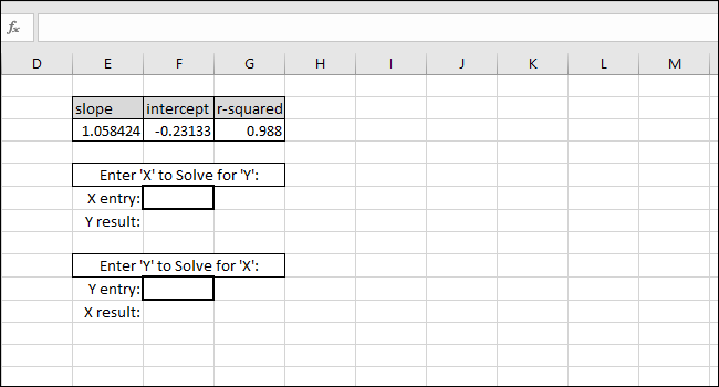
The equation of the line-of-best-fit is in the form “Y-value = SLOPE * X-value + INTERCEPT,” so solving for the “Y-value” is done by multiplying the X-value and SLOPE and then adding the INTERCEPT.
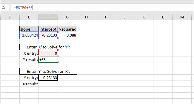
As an example, we put zero in as the X-value. The Y-value returned should be equal to the INTERCEPT of the line of best fit. It matches, so we know the formula is working correctly.
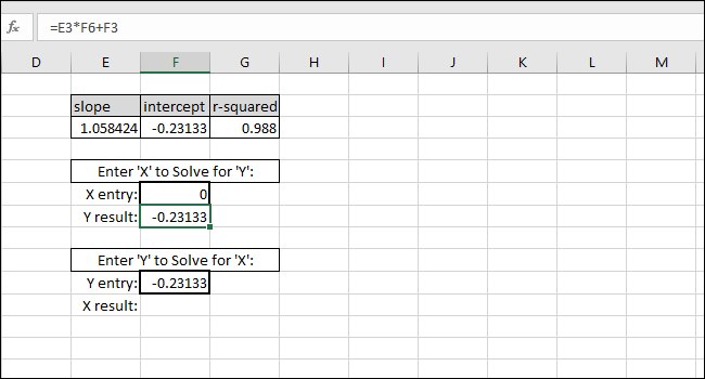
Solving for the X-value based on a Y-value is done by subtracting the INTERCEPT from the Y-value and dividing the result by the SLOPE:
X-value=(Y-value-INTERCEPT)/SLOPE
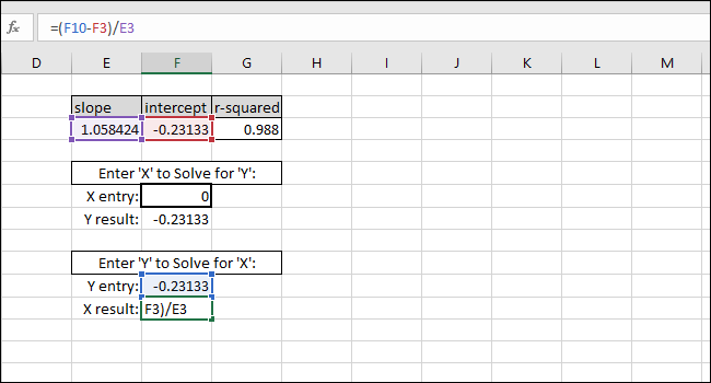
As an example, we used the INTERCEPT as a Y-value. The X-value returned should be equal to zero, but the value returned is 3.14934E-06. The value returned is not zero because we inadvertently truncated the INTERCEPT result when typing the value. The formula is working correctly, though, because the result of the formula is 0.00000314934, which is essentially zero.
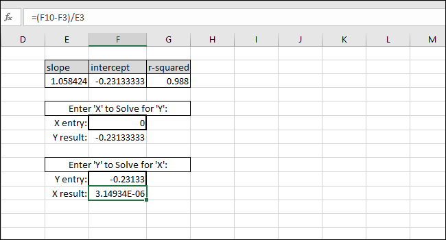
You can enter in any X-value you’d like into the first thick-bordered cell and Excel will calculate the corresponding Y-value automatically.
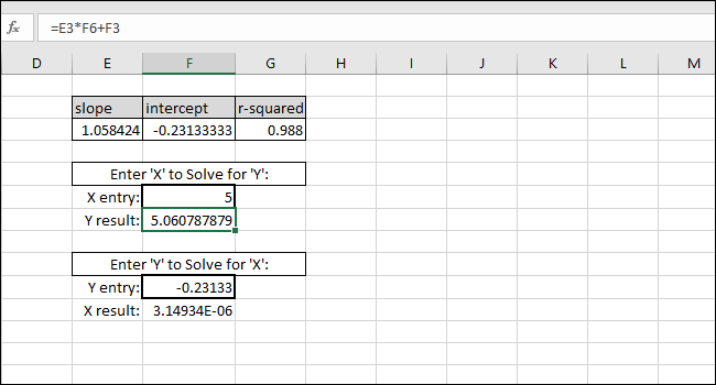
Entering any Y-value into the second thick-bordered cell will give the corresponding X-value. This formula is what you would use to calculate the concentration of that solution or what input is needed to launch the marble a certain distance.
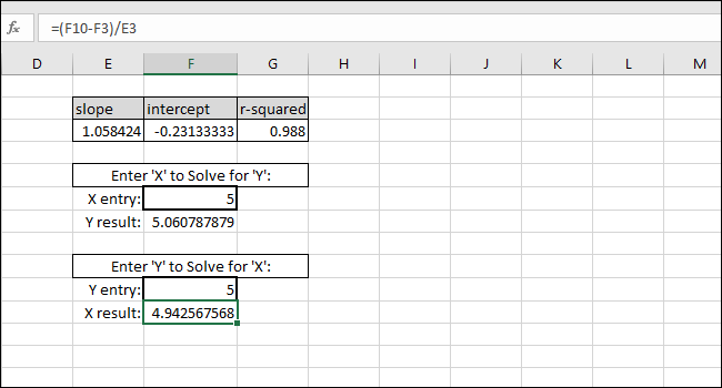
In this case, the instrument reads “5” so the calibration would suggest a concentration of 4.94 or we want the marble to travel five units of distance so the calibration suggests we enter 4.94 as the input variable for the program controlling the marble launcher. We can be reasonably confident in these results because of the high R-squared value in this example.
Also read:
- [New] 2024 Approved Maximizing Your Social Media Impact Group Photos/Videos on IG
- [New] Snapchat-Like Stories Adding Movement to Instagram Texts
- Beat Steam Error Code N130: Ultimate Fixes and Tips Revealed!
- Fixing GameLoop Issues: How To Prevent Your Games From Crashing On Windows 11 & 10
- How to Screen Mirroring Oppo A78? | Dr.fone
- How to Smooth Out Bloodhunt Gameplay: Solutions for PC Stutter and Crash Issues
- In 2024, Swiftly Uninstalling YouTube Videos From Devices
- Inside Story of the Delayed Mafia: Definitive Edition – What We Know So Far Resolved
- New Best MTS Video Editors Top Picks and Reviews
- Overcoming Print Pairing Problems: Ensuring a Smooth Link Between Your Printer and Desktop with YL Solutions
- Starfield Errors Solved: How to Ensure Smooth Gameplay on Windows and Mac
- Understanding WSAPPX: Identifying the Cause of Excessive Resource Consumption
- Will Pokémon Go Ban the Account if You Use PGSharp On Oppo A2 | Dr.fone
- Title: Step-by-Step Guide: Creating a Linear Calibration Curve Using Microsoft Excel
- Author: Christopher
- Created at : 2024-12-08 17:00:19
- Updated at : 2024-12-12 18:24:37
- Link: https://win-blog.techidaily.com/step-by-step-guide-creating-a-linear-calibration-curve-using-microsoft-excel/
- License: This work is licensed under CC BY-NC-SA 4.0.